Pages

Monday, October 15, 2012

More play/experiment (is there a difference?)

Papers

35 paper samples!  Most of the results were OK, and some were surprisingly good (extra bright, translucent etc.) and some were not (disintegrated paper, paper that wouldn't absorb the chemicals at all, etc.)


Color!

Egg tempera, gouache, oil-based color pencil, ink...  More to come.


More prints...


Played around with compositional elements of manuscripts and manuscript decoration (see negatives in previous post).  In the first, I did most of the arranging and "layering" in Photoshop.  I added photographs (hard to see) and a "blankie".  I miss the element of chance that is there when I physically layer and arrange various transparencies.  I may do another layer of exposure or stick to my original plan of adding metal leaf.


Thursday, October 11, 2012

Visit to the Haas Arts Special Collections at Yale

I took photos, but do not have permission to post.  I will try to post links to artists' websites.

Contemporary Illuminated Books/Manuscripts

Tamar Messer:

Most of her work is bright and full of color (see the Book of Esther).  The exception is her Book of Lamentations-- very stark black and white linocuts.  I liked the interplay of "hand-printing" and "digital-printing".

Avner Moriah:

Moriah adapts his personal style to the style that would best suit the manuscript: the Book of Genesis is done in a more "primitive" symbolic style, and the Scroll of Esther seems to be influenced by Persian manuscripts (based on manuscripts I saw at the Met).

Yael David-Cohen

The Book of Esther was unbound with etchings, chin colle, and hand written text in graphite. The paper looked like half sheets of watercolor paper.

Manual of Illuminated and Missal Painting, Edwin Jewitt, 1860

Discussed color, design, pigments etc. and had reproductions of designs and calligraphy.  In discussing the designs in illuminated manuscripts, the author wrote: 

"The student may... be assured that to be true to nature will give his productions their greatest and most lasting charms... Art should always be based upon nature, and be made subservient to it, and the two so combined as to make a perfect and pleasing whole." (page 26)

Whether this applies to all art or not, it strengthened my desire to incorporate my nature writing, cyanotypes (which use nature in the process), and illuminated manuscripts.

Contemporary Cyanotype Art Books

Nora Lee McGillivray

Mapping the Great Book:


All in cyanotype, the pages open from the center and there is a round globe-like book in the center.  The artists used all sorts of objects (even pearls?) to create the illusion of stars and planets.  There are some red markings to compliment/contrast the blue. This book is about celestial bodies and in the credits it says "This book... was printed by the Sun at 45'03' North Latitude, 93'08' West Longitude..."

Between Us and Far Away:

A long folded (accordion style) book within a "house".  Otherwise similar to Mapping the Great Book.

Carolee Campbell

XXIV Short Love Poems, Bruce Whitman 2002

The cyanotype images are very small (1.5 inches?) and very intimate.


Wednesday, October 10, 2012

More Digital Negatives

Inspired by the calligraphic designs and the various compositions in the illuminated manuscripts, I played with doodles and sketches and made designs in Photoshop.  I printed on 13 by 19 sheets.


Thursday, October 4, 2012

Beinecke Library Visit 1

I saw (and held!) original illuminated manuscripts and high quality facsimiles.  There are so many things that could only be seen in person-- wine stains, ink bleeding through paper, gold leaf fading and revealing red (glue?) underneath, etc.  I also saw some cyanotype documents.
Below, are most of the manuscripts I saw.  All images were taken of manuscripts in the collection of the Beinecke Rare Book and Manuscript Library, Yale University.

Psalms, Job, Proverbs

Florence, 1467
This was small and beautifully detailed...
I was inspired by the calligraphic designs around headings.  The designs were balanced, yet were also very expressive.  No two were the same.
Links to hi-res images:

Shiviti Plaque, Morocco, 19th Century


The Washington Haggadah (facsimile), 1478:

Illustrated by Joel ben Simeon who was forced to move from Germany to Italy because of persecution and expulsions.  His later illuminations are a combination of German and Italian styles.
A link with excellent reproductions: http://www.hup.harvard.edu/features/haggadah/
Notice the layering of text because of the ink bleeding...

Haggadah, Mainz, 1726

Wine and matzo stains!


North French Hebrew Miscellany, 1278 (facsimile 2003):

Gorgeous calligraphy and micrography.  I took photos, but unfortunately don't think I could post because of copyrights.  Here is a link:

Shavuot Manuscript, Kashan, Persia, 1883:

worm holes!


Cyanotypes:

I discovered new ways that cyanotypes were used (legal, maps, anthropology?, instruction, general printing), and it was instructive to see the scale of the images.

Letters relating to the Peter Pan Gold Mining Company, including cyanotype map of Montezuma, Women's Rights and Women's Rights Fraction mining claims (1910-1911)

The cyanotype was done on standard sized paper-- probably to fit with the legal sized papers of the document.  It's an interesting map-- looks more like a diagram.

FYI:  Apparently there are mathematical reasons for standard paper sizes, but they don't hold up for book pages.  Also the ratios that work for the paper size, do not work for font sizes.  More info:

Photographs of Indian children (ca. 1900)

These were very small and invited closer intimate looking.  Notice the key for scale.  Also, a link with higher res: http://beinecke.library.yale.edu/dl_crosscollex/brbldl/oneITEM.asp?pid=2010717&iid=1049734&srchtype=CNO


Album de Corbeilles et Mosaïques Florales: Eté Hiver (ca. 1907) 

"Album of Flower Baskets and Mosaics: Summer and Winter"
This looked like a tutorial for making floral designs and drawing fruits.  It also included charts on different fruits and garden plans.  This was a wonderful discovery.
For artistic reasons, I have already begun to include "designs" in my cyanotypes, and here cyanotypes were used to create designs for seemingly practical printing purposes.  It reinforced my desire to incorporate illuminated manuscript elements into my cyanotypes.


New York!

The focus of this trip was illuminated manuscripts.  I went to Crossing Borders: Manuscripts from the Bodleian Libraries at the Jewish Museum.  Then I spent a couple of hours at the Met.  It was an awesome day...

Crossing Borders at the Jewish Museum

There were many cross-cultural connections made among the manuscripts displayed-- Hebrew, Latin, Arabic etc.-- that were enlightening.  Christian writers were strongly influenced by Rashi, an 11th century Rabbi, and the styles of Hebrew scripts were influenced by the language of the place where they were written. 

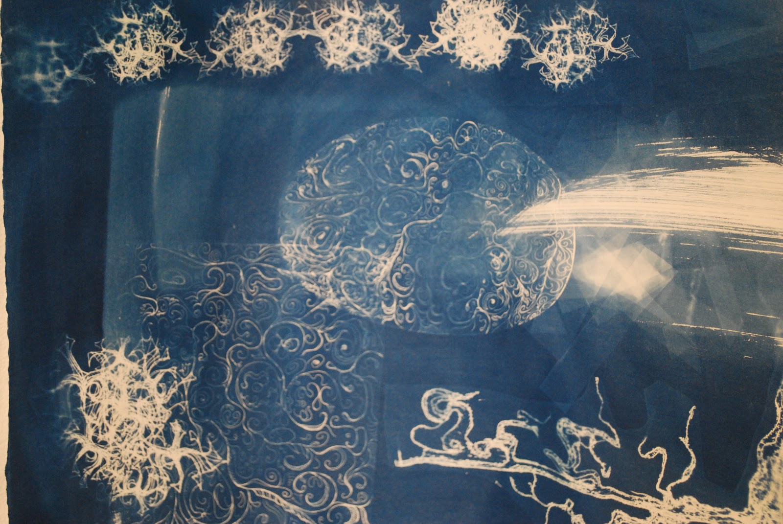
Some highlights for me were handwritten manuscripts by Maimonides, illustrations/diagrams by Rashi, diagrams and maps incorporated into manuscripts, handwritten notes, micrography, and the scale of some of the manuscripts-- quite small, delicate, and intimate.  It made me reconsider the way I use scale.

I took LOTS of pictures, but the Jewish Museum has such a wonderful website for the exhibit (including reproductions of full manuscripts).  Here is the link:

Metropolitan Museum of Art

I saw Paintings on Parchment: Italian Renaissance Illuminations from the Robert Lehman Collections
The Galleries for the Art of the Arab Lands, Turkey, Iran, Central Asia:  There were exquisite manuscripts throughout (including a few in Hebrew), with beautiful designs, colors etc.
I also saw Japanese, Chinese, and Egyptian manuscripts and scrolls.  

I noticed many similarities in manuscripts across cultures-- mainly in materials (the inks and gold leaf), but also in design and composition.  It seemed to me that the connections were stronger in manuscripts than in other art forms.  

Here are a few of the many photos I took (I apologize that I do not have accurate descriptions of all the works-- the photographs of the plates are not all readable):
Shiraz, Iran, 15th Century


Sakai Hoitsu, ca. 1820 (left), and Suzuki Kitsu, mid 19th century

Poetry Screen (Waka Byobu): Six Poems by Women Poets
Konoe Nobutada  (Japanese, 1565–1614)
Scene from The Ise Stories: “Mount Utsu” (Utsu no yama)
Tawaraya Sôtatsu  (Japanese, died ca. 1640)


Xi Hu, Hangzhou, Zhejiang, ChinaLois Conner  (American, born New York City, 1951), Lois Connor, 1998 

Monday, September 24, 2012

Drawings, Composition

The exposures weren't great, but I think these are all worth another shot...


Starting to think about the composition for the Esther Scroll:


Inspired by this Iraqi megillah (Braginsky collection):

Playing with patterns:


Inspired by:

An old tree drawing:


Leonardo's water studies: